Aurora
Aurora Visual Identity
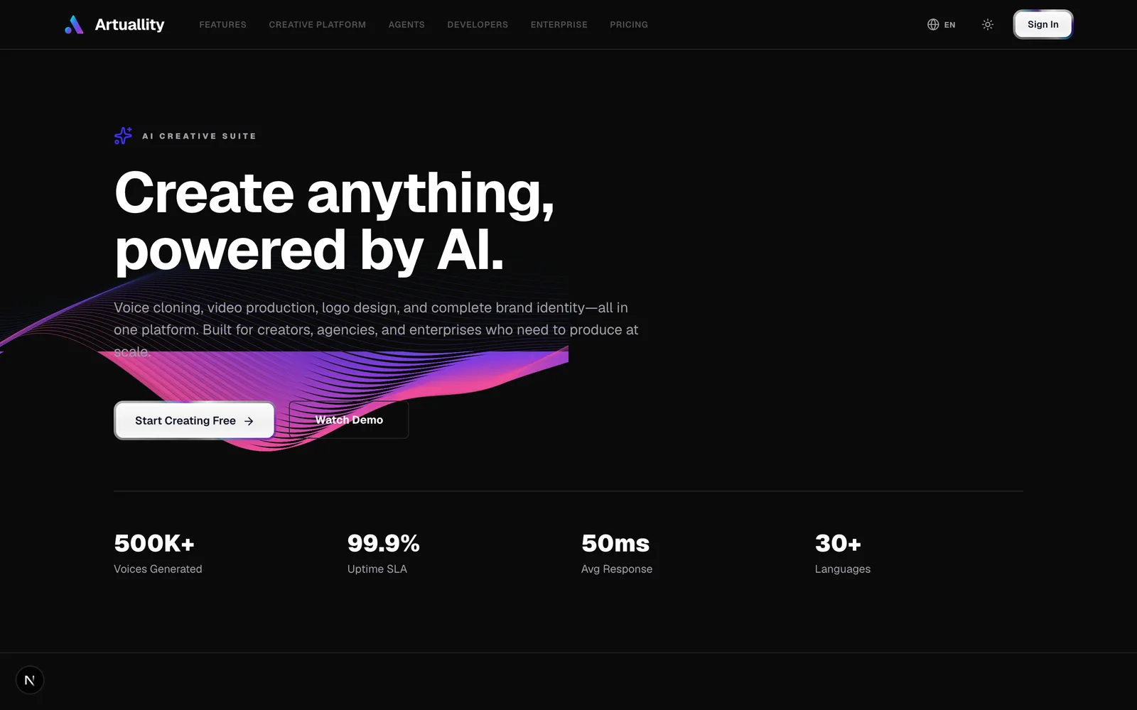
A premium, dark visual identity for an AI creative-automation brand — luminous violet accents, precise typography, and one visual field across logo, UI, and collateral.
- Industry
The Opportunity
An AI creative-automation brand needed an identity that felt intelligent and premium without tipping into generic sci-fi.
The Thinking Behind It
Friendly shaped a calm, cinematic identity: deep black surfaces, controlled violet-blue glow, Swiss-inspired type, and orbital brand marks.
The Experience We Created
One coherent visual language across logo, app icons, color, typography, interface, packaging, and collateral.